Graphic Design has always been my passion. In fact, it’s how I got into Creative Design in general. What started out as sketches and messing around in Photoshop quickly turned into one of my favorite things to do. Any project I’m involved in I try to add some visual flair to it by focussing on the aesthetics; making logos, animations, UI or sometimes even physical media. To me, a game needs to impress me with its visual style first and it’s often the detailed design touches that really bring it to life.
Game Logo Designs
Dune Initiation
Logo for a Dune fan game made in After Effects.
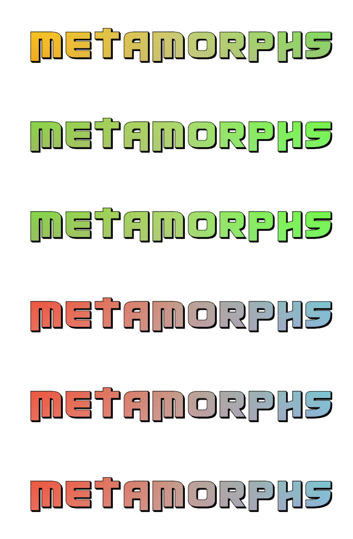
MetaMorhps
AR Tamagotchi-type game where you collect and raise virtual pets called Morphs.
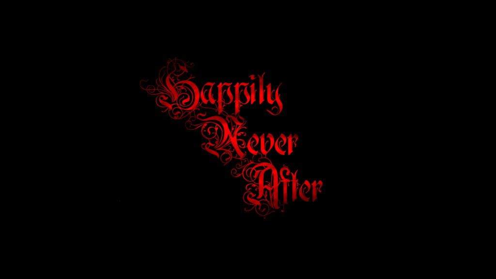
Happily Never After
Logo for an action/horror game set in a dark fairy-tale forest where you play as grown-up Hansel and Gretel, turned witch-hunters
Black Hat Bandits
After Effects animation for the logo of Black Hat Bandits, a game where you play as a cowboy hacker
SOL.AR
Logos for solAR, an Augmented Reality app to discover the cosmos.
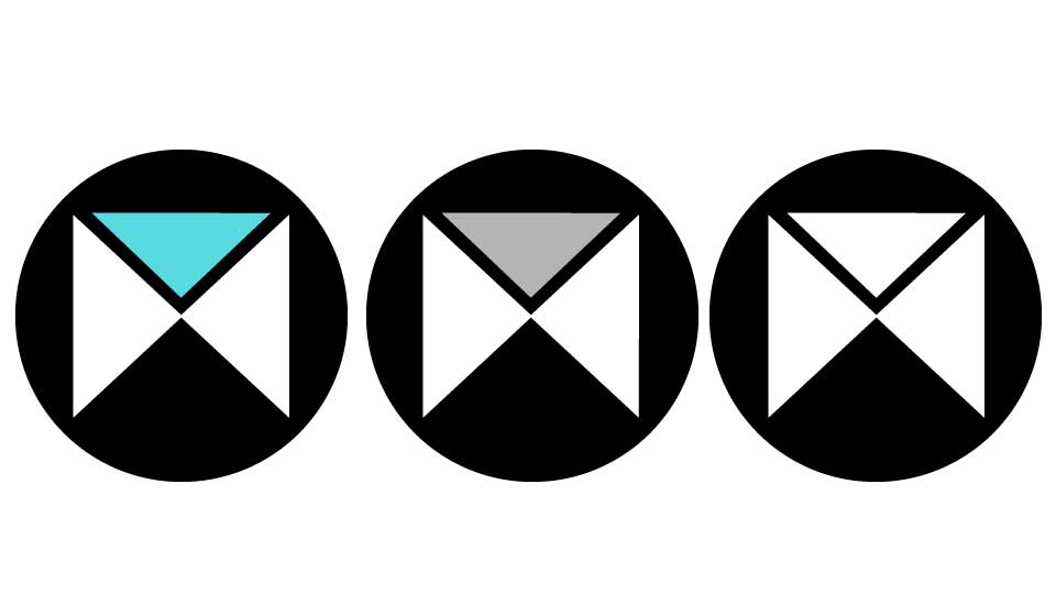
A futuristic and minimalist design that symbolizes both an eye (the driving factor for Augmented Reality) and a solar system.
Colored variations of earlier design
I tried creating fitting color palletes but found that just using black and white made the most striking and eye-catching logo. These colors (or alternatively some gradients) could of course be used to make it more playful if the app would get marketed to kids.
Oorbellerie
Logo for Oorbellerie, handmade recycled and totally unique earrings
With a unique logo resembling both an O (for Oorbellerie) and a unique earring, this logo gives you an idea of the eccentric and striking nature of the earrings produced by Mirjam Scholten. The font also gives it a chique and high-end expression.
Varying on the color pallete gives the logo a handmade vintage look and expands on the usability of the logo.
merijnkersten.nl
Logo for my brother’s site, merijnkersten.nl
The assignment was to make a logo with his first initial and make it look modern and sleek. After many drafts I decided to go with this design, which looks like the arrow keys on a game controller or puzzle pieces, with the blue piece completing the puzzle (signifying his problem solving ability). The sharp edges give it a futuristic look while the personable font makes it look a little bit more friendly and approachable.
Logo Marks
Circling the logo to make a logo mark makes it look more playful and makes it usable as an icon on a website.